No week ever goes exactly to plan. One client pushes a meeting. Another adds a last-minute task. A personal appointment takes longer than expected. The best planning systems aren't rigid. They flex with the flow. That’s where a smart weekly layout comes in. Built right, it acts like a map that updates mid-journey without losing the path.
Adjustable weekly spreads help prioritize time over tasks. They leave enough structure to anchor commitments but not so much that they become obsolete by Wednesday. It’s a system that thrives on edits, tweaks, and reality.
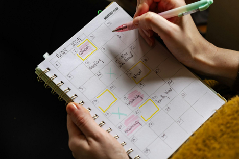
Fixed-day slots can get in the way of real-time shifts. A better approach starts with a divided space that doesn’t lock anything down. That means using columns or boxes labeled loosely, like “Top Priorities,” “Client Calls,” or “Errands," instead of sticking to traditional Monday-through-Sunday grids.
Some layouts split the week across two pages: the left side carries major tasks and goals, and the right catches shifting details. The result is a dashboard rather than a calendar. Things stay visible, but nothing feels fixed in stone.
Using a weekly undated planner adds even more control. Without pre-set dates, it’s easier to skip days that don’t need structure or double up when plans stack higher than expected.
Too much ink on a page kills momentum. A good weekly layout needs breathing room. This helps plans stay nimble and uncluttered even as priorities change. Margin space can absorb new tasks. Empty lines allow room to rewrite time slots or shift checkboxes.
This approach is less about minimalism and more about flexibility. A spread-packed edge-to-edge with icons, stickers, and colors might look satisfying, but it leaves no room for the unexpected. Plans that shift midweek will pile on top of old ones, creating visual noise instead of clarity.
Clean layouts give decisions room to grow.
Color-coding and stylized headers can be useful tools as long as they support structure. Picking consistent icons for categories like follow-ups, billables, or deliveries can help scan a page faster. Hand-drawn dividers or light pencil guidelines can break the layout into segments without making it feel locked.
But looks come second to function. Stickers, washi tape, and extras should support workflow. Use design to guide the eye toward urgency, not just to decorate the margins.
Weekly planning doesn’t need to look perfect. It needs to make sense at a glance, even after plans change.
A working layout changes shape throughout the week. What starts as a to-do list might turn into notes, follow-ups, or new deadlines. The best spreads allow those transitions without requiring a full rewrite.
Daily blocks that start with clear boundaries can shrink or stretch based on real use. For instance, a section labeled “Meetings” on Monday might need to double in size by Thursday. This is where erasable pens, sticky notes, or lightly shaded blocks help keep flexibility without smudging the system.
Layouts don’t need to be symmetrical. They need to match momentum.
No matter how many shifts during the week, certain anchors help stabilize the plan. These usually include:
These elements prevent overwhelm. They also keep the layout aligned with what’s most relevant now, not just what was planned two days ago.
It’s not about adding more boxes. It’s about giving those boxes a job.
Templates and layout ideas are everywhere, but copying someone else's spread won't always solve scheduling issues. What works for a full-time creator may not work for someone managing client accounts or juggling family logistics. Weekly spreads should match how decisions are made and how interruptions are handled.
Some layouts will need daily reflection. Others will benefit from weekly intention setting with small tweaks each morning. The right spread adjusts based on what kind of week it is.


